Would it be possible to have a linux DE with that high quality like macOS? The last 3 years i did a lot of distro hopping. Im really Happy with gnome and ubuntu now ( reason was the rocm Installation script for my 7900xtx). Currently i donate whenever i use a Software more frequent. So i also would pay for a such good Look like on an iMac from my wife. Currently i use 4k Resolution and coloring settings with my spyder color camera. Edit: Im talking about sharpness of font rendering
Final Edit:
I switched from ubuntu to cachy os with native KDE: The soltuion is really nice so thanks for the community feedback!

Gnome is just as beautiful as MacOS. The only difference is that MacOS is colorful, while Gnome is more b&w in its design. In fact, I’d say that gnome is more modern than macOS in its overall design philosophy. So modern, that some people hate it, lol. But modern nonetheless.
I love Gnomes design btw. My second favorite after Android.
I recently started using the openbar extension which adds a lot of color to Gnome with just a few clicks.
Sharp as, it looks blurry or sharp as, its not polished?
Ahh good hint. Not polished. Windows could be more beautyful for example.
@Banthex@feddit.org i get what you saying. but as i lack experience with distros i find it interesting. can you add a few more examples of polished like how?
 for example the corner on the left. Buttons somehow look better.
 macOS gives the the feeling of sharpnes. Im so sorry its so difficult for me to discripe it.
I’m still unsure if you mean sharp as in clear, crisp high resolution / not pixelated / not blurry or “better” design / ui(x).
If the first check (fractional) scaling settings / font anti aliasing / smoothing options (I don’t use Gnome so don’t know where), if the latter, one is a small team of probably underpaid devs (Gnome), the other one of the wealthiest companies in the world (Apple) so I’d sure hope Apple’s UI is “better” than Gnome’s (though looking at Windows it doesn’t seem like having money equals good design, lol).
Yes also the gtk thing. Maybe what i search is that all software ui’s should follow a better design template? But i understand the feedback for ui freedom.
Part of using GNOME (at least to me) is expanding on the interface and building a personal experience through extensions.
Cover-flow when and-tabbing? Extension. Dynamic opacity of top bar? Extension. Wiggly-wobbly effects when dragging or minimising/maximising windows? Extension. Installing custom themes? Guess what, that’s an extension too!
I think you understand where this is going.
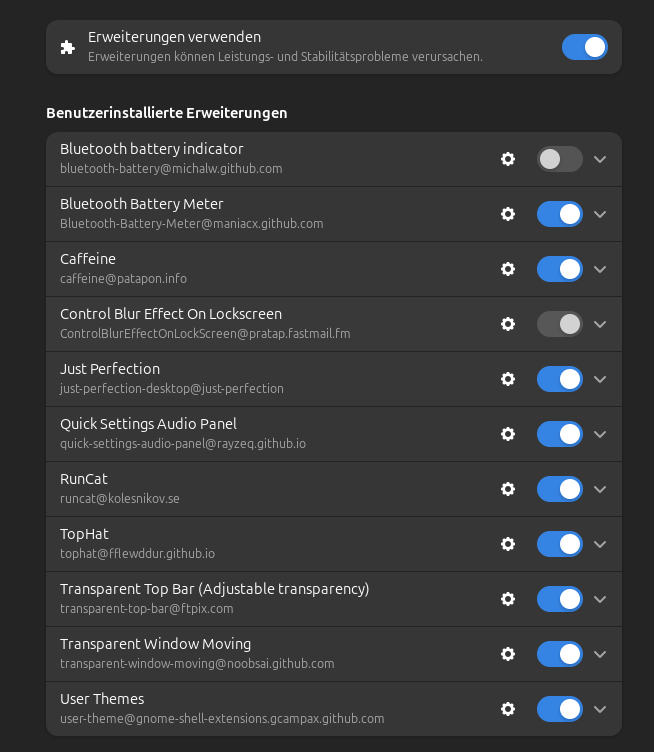
In terms of polish (looking sharp), GNOME is the best on linux, still it can look much better in terms of eye candy if you add extensions. I think I have like 50+ extensions myself.
Thanks good feedback
Alright. Let’s have it. What’s the extensions that enhance the look of Gnome, propelling it into eye-candy heaven?
Im using this but suggestions would be helpful:
yes, i get it. it’s sort of a thing that my brain can’t describe either, but want to hear someone go about it continuously to get it better.
It’s transparency and blur, gnome favors performance over looks (not that it looks bad), you can get the same look on gnome if u theme it
As others have said, it is not entirely clear what you mean by sharp. Based on the rounded corner and button example you gave previously, I think it might just be the graphic design. MacOS has had a lot of time invested into its design language including subtle things like a thin, almost glass-like specular border around windows and then a drop shadow. This very much becomes a matter of taste in many cases, but for some it helps identify boundaries more precisely. Perhaps have a look at https://github.com/vinceliuice/WhiteSur-gtk-theme, which replicates MacOS as closely as possible. You may be able to experiment with it side by side and see if you can figure out exactly what design element it is that you are looking for.
KDE Plasma may be a lot more customizable than Gnome, so you might be able to find something more like what you are looking for there. I would do a web search for varied examples if I were you.
You could search for more Gnome examples too. I believe Gnome requires more in the way of plugins for customization, so you might have to seek out examples of gnome plugins that customize look and feel or window styling. I’m just speculating here, I don’t really know Gnome very well.
I will force me to test KDE for a longer therm. Thanks for the feedback.
Because Linux doesnt compete with MacOS? Linux doesnt compete against any other OS because unlike Windows or MacOS Linux isnt owned by a for-profit organization (Linux doesnt have something to sell). Gnome is driven by community efforts to polish a community maintained set of tools, I would say theyve done a very good job.
Indeed great work!
Because it’s not Plasma 6.
This comment should be deleted soon
No.
So from some of your comments, it seems that by sharpness, you are referring to the sharpness of text in gnome on high resolution displays (4k in your case) when compared to macos or windows. Well in my experience, text rendering in Linux hasn’t been as good as the macos or windows but it has been improving steadily. If I remember correctly, the differences lie in the anti aliasing done to text to make them sharper. Somebody please correct me if I am wrong.
Also maybe edit your post to mention that the high quality you are talking about is the sharpness of font rendering.
Thanks this was that im looking for.
You won’t get the same united look in Gnome as in mac OS. Applications will look a bit different and not exactly the same.
I think you get used to it though. I don’t think about it at all anymore.
Not really true if you just stick to modern GTK apps. Almost always if you find a program for a specific purpose using Qt (KDE graphical framework) someone’s make a program for the exact same function. Is it basically pointless other than keeping theming and style consistent? Yes, but that’s enough for me unless there truly is an essential function missing. Basically the only Qt application I use is Strawberry Music Player because it’s extremely featureful.
Depends on the usage though. While I prefer GTK over Qt as well, for me there are no GTK alternatives for Krita, Kate and Ghostwriter.
And then there’s kvantum.
Gnome emulates MacOS in the worst ways possible. See: all the whitespace in gtk apps.
If you want the MacOS experience, install Garuda. Personally, I hate that global menu, and the first thing I do on a fresh install is get rid of it, but if that’s what you like…
It’s KDE, not GNOME, though.
Check elementary OS
Did it a few times and was not happy, thanks. For gaming and rocm not good.
Have you tried theming gnome? There’s a ton of videos on youtube if you’re a beginner, i wonder if you’ll have the same thoughts after theming it
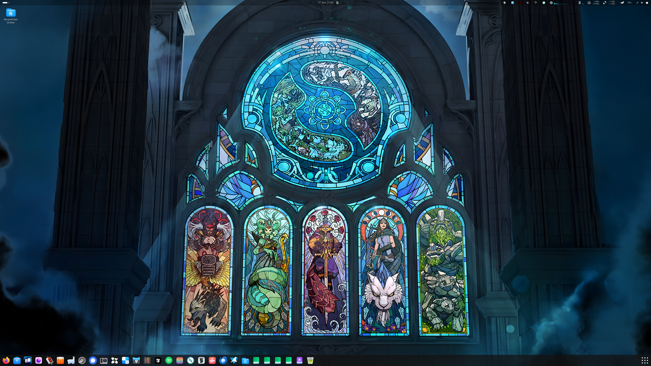
Please have a look at my current desktop.
Do yourself a favor and ditch GNOME for KDE. You’ll be glad you did. Especially if you’re into theming.
I tried to do that a little while ago, but I just couldn’t get used to the Menu on kde. Even with themes, it was miles behind ArcMenu on gnome.
I’m not sure I know what you’re talking about. Is it the global menu?
Ah, I only remember it being called the Menu lol. KDEs equivilent to a start menu in windows
I did and the cornors really look better.
 the corners look better in KDE then in gnome
Consider adding the Dash To Panel extension. It was the polish Gnome was missing for me: https://extensions.gnome.org/extension/1160/dash-to-panel/
I’d also be a bit remiss if I didn’t recommended WinTile, too: https://extensions.gnome.org/extension/1723/wintile-windows-10-window-tiling-for-gnome/
Great thanks!
If you want a nice looking distro with some interesting features try Nitrux: nxos.org
immutable. So, no, sorry.
What speaks against immutable? Had bazzite for gaming for a while that was realy nice.